Written by Jane Hames
On some recent Excel 2010 training a question came up about how can the totals be shown as data labels rather than as a bar in the chart. In pre-2013 versions this is not obvious and to begin with I was stumped, but (as is often the case with software use) a bit of creative thinking and trial and error, we came up with a solution. Here’s what we did:
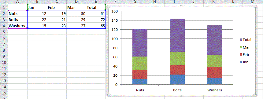
- Starting with a chart like this, we want the total bars to be removed and shown as a data label instead.
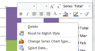
- Right click on one of the bars respresenting the total and select Change Series Chart Type.
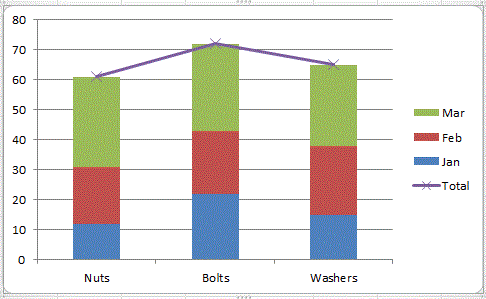
- Select a Line Chart
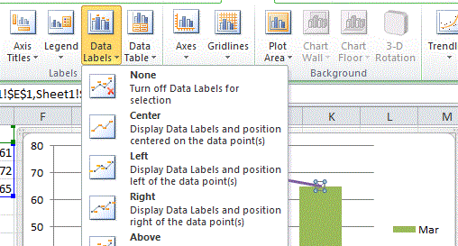
- Click on the line and set it have Data Labels.
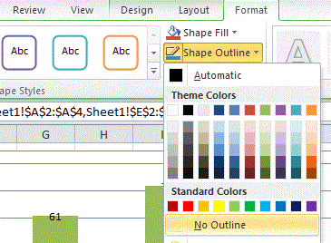
- Set the line to have No Outline so that it will be invisible.
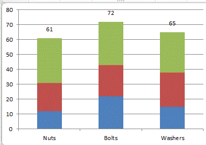
- Now you have a stacked column chart with the totals shown as data labels
